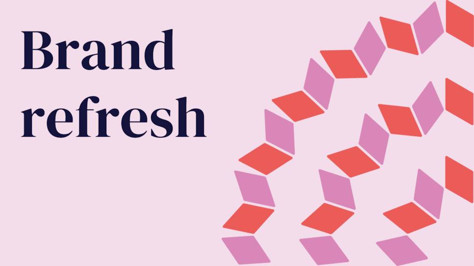
Our Brand Refresh: Celebrating a Century of Scotland's Living Memory
To mark our 100th birthday in 2025, we’re refreshing our brand.

Our New Logo
Our previous logo, featuring a representation of a book or laptop, has been reimagined. By duplicating this symbol in a circular pattern, we convey a sense of collection, unity, and community—core aspects of our identity. This design reflects our commitment to balancing tradition with innovation, preservation with access, and the past with the future.
Typography and Accessibility
Inclusivity is central to our vision. To enhance readability for all, we've adopted Atkinson Hyperlegible as our primary typeface. Developed by the Braille Institute, this font is designed to improve legibility for readers with low vision, ensuring our communications are welcoming to everyone.

Colour Palette
Building upon our traditional blue, we've introduced a warm and inviting array of colours. This new palette symbolises openness and invites individuals from all backgrounds to engage with our collections and services.
Looking Ahead
As we step into our second century, we remain dedicated to preserving Scotland's past, enriching the present, and inspiring future generations through access to knowledge, culture, and innovation.
We’re already thinking about the next century of our work. Look out for our new strategy later this year.